
Home Index | Project One | Project Two | Project Three | Photoshop
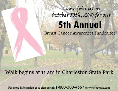
This postcard is an advertisement for breast cancer walk fundraiser.The postcard has a picture of the park where the event is supposed to take place, and is incorperated with the breast cancer symbol. Even though it is meant to be physically attractive, the information that is necessary is clearly presented and easy to read. People can quickly glance at the postcard and retain the information of where the event is taking place, what it is, and how they can get involved. This postcard is visually pleasing because it depicts the cause that the post card is representing in a simple and easy way that won't overwhelm the reader but just show them what they could get involved with. Overall, I think this design does a good job of relaying the message that it needs to but still look nice enough to draw a person in and take the time to read the information.