Home Index | Project One | Project Two | Project Three | Photoshop
For this project, we had to design an album. Although the artist featured is not real, this design would still be effective. It presents a clear theme and blends creativity with simplicity and clarity. The goals I had for this design was for it to be appealing to the eye and grab the attention of someone who might see it at a store.
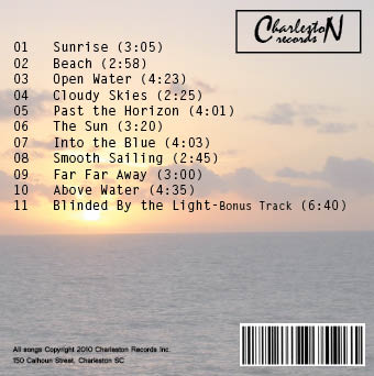
The front of the CD case uses a gradient that shows the theme of the entire CD. It presents the artist name and title of the album, and the image gives a clear representation of what the rest of the CD will be like. Although the front of the CD gives the initial interpretation of the CD, the back cover hyas more information that completes the design. This background stays with the same theme but also contains the recording label logo for "Charleston Records". This logo was designed to be simple and still recognize the company clearly. It presents the title, name and duration length of all eleven songs. At the bottom there is also a barcode and copyright information.
Even though this album design contains alot of information, it is spread out clearly to avoid getting cluttered or being confusing and has a successful design.